Elastic Token-Driven Design System
UX Design, UI Design
Onwelo
2024

Atomic Design System Project aimed on rapid adaptation to clients visual identity.
Atomic design is a methodology composed of five distinct stages working together to create interface design systems in a more deliberate and hierarchical manner. Inspired by chemistry, it identifies five stages: Atoms, Molecules, Organisms, Templates and Pages.
Chapter 1: Atoms
Atoms are the smallest piece of a design, but as you’ll see it’s also its foundation.
1.1 Colors
On the path towards flexibility we identified that colors have to be desitnation oriented. Same HEX can be used various times in the project, but it does not have to mean it’s purpose is same every time. For example you can make white #FFFFFF as surface color same as text on the surface of a button, but if you want to translate this token into dark mode problem occurs:

As you could see on the picture above white token should remain white on a button surface and change into black on regular surfaces. That’s why those two tokens should be detached.

Concluding we’ve created MaterialUI-inspired color token naming system for maintaining flexibility across various products. Solutions like this limit development resources necessary to kick-start projects.

1.2 Text
Text has got two base tokens included: Font Family and Type Setup. Similarly to color tokens we suggest naming it purpose-oriented not size oriented. Font Family is a special token type which impacts Type Setup tokens.

As you can see on the example, using size-based tokens takes away flexibility in terms of changing font families, weights and sizes across various components such as text and buttons.

Purpose-based text token approach creates a lot of styles, which can create difficult entry treshhold. However, it gives a lot more flexibility on re-using components to various projects.
1.3 Grids
We use 3 basic grid setups: 4-collumn for mobile, 8-collumn for tablets and 12-collumn for desktop.

1.4 Shapes
Shapes are a silent member of atoms family, often concidered as just icons, we have to remember that every rectangle or circle used in design is also a shape, but it’s rarely listed as a component.

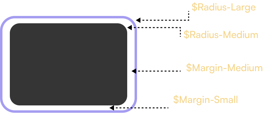
1.5 Variables
At this point we concider two types of variables: Corner-Radius token and Margin token. Those two are closely connected, as when you decrease your margins you also have to decrease corner radius difference for optical balance.
1.6 Motion
Motion is key to success but it’s also a vast topic. Our motion system could be the object of a separate case study. For now, we distinguish two types of tokens: $Bezier-Type and $Duration. Certain beziers and durations are predefined for certain action types across whole design system.

Chapter 2: Molecules
Molecules are made up of a collection of many atoms.
2.1 Buttons
Buttons are key elements in interfaces but are also very illustrative in terms of creating molecules from atoms.

Paddings are also important for buttons, because we should maintain optical balance. That’s why we don’t use margin tokens for them. Spot the difference in horizontal paddings on picture underneath:

At the moment we distinguish 4 types of buttons in terms of construction: Icon-Right, Icon-Left, No-Icon, Icon-Only; as well as 3 sizes (S, M, L) and 7 purposes: Primary, Secondary, Complementary, Outlined, Text, Danger and Transparent (for custom-color surfaces). Each of them occurs in 5 states: Default, Hovered, Pressed, Focused and Disabled. Estimating this gives 420 types of buttons.
2.2 Other molecules
Same approach is used in other molecules such as: Badges, Checkboxes, Chipses, Collapses, Flies, Inputs, Loaders, Radio Buttons, Search (Specific type of input), Stepers, Switches.

Chapter 3: Organisms
Organisms are made of atoms and at least one molecule.
3.1 Organism construction
Organisms are large components of an interface. Their construction is complex, they contain a lot of atoms and at least one molecule.

Another great example of this approach is podcast card for horizontal-scrolled surfaces (for example carousels):

3.2 Organism reductivity
Organism components are created with maximum data capacity, but reductive approach makes it look good even when component receives smaller data range.

3.4 Combining tokenization and reductivity
When we combine tokenization and reductivity, we gain a lot of visual flexibility:

Chapter 4: Templates
Templates are very advanced type of atomic structure. Templates are mostly ready-to-use sections to build custom pages.
4.1 Listing types
First type of templates are listing types, i.e. recommendations on display patterns


4.2 Large components
Biggest component structures containig a lot of other components.

Chapter 5: Pages
Pages are most advanced structures in the Design System. It’s a collection of ready to use screens built from all types of structures.
5.1 Legal-Driven Screens
Pages which shape or purpose is determined by law, for example: User Data Change, Onboarding Process Screens, Store Refund Process Screens, Clearing and Exporting User Data.

5.2 Content display templates
Display templates for content types available in Squidex CMS.

5.3 Screens for grouping content
Display templates for content types available in Squidex CMS.

5.4 Overlays/Bottom Sheets
Bottom sheets show secondary content anchored to the bottom of the screen. They are often used when user needs to do something while not loosing track on what’s happening elsewhere.

Chapter 6: Proof of concept
All of this would be worthless if we haven’t have shown you some proof to our concept. Let’s dig in!
6.1 Home Page
Following screens contain 3 verisons of a home page made with our design system. One of them is plain, two are product-arranged.

6.2 Content Screens
Following screens contain 3 verisons of a article page made with our design system. One of them is plain, two are product-arranged.

6.3 User profile
Following screens contain 3 verisons of a profile page made with our design system. One of them is plain, two are product-arranged.

Chapter 7: Conclusions
- Combining component reductivity and tokenization earns a lot of flexibility in terms of fast component adjustment to new projects.
- Using predefined screens saves time in areas that customers do not pay attention to and expect them just to work.
- Content is a true king. As far as components set mood to the app, content gives it character.
- Design system is not a component library. It’s a set of guidelines and thought patterns when designing interfaces.
- Atomic approach gives opportunity to re-use interfaces in a visually-changed, but still consistent form.
- Setting a design system this big is a lot of work, but it pays off at the development stage.
Thanks for reading until the end!
Thank you for staying that far. I know I could have provided a lot of more detail, but I tried our best with making it both engaging and meaningful. Unfortunately I can’t share more due to NDA commitments. If you are interested in my work contact me! Behance version here.
related work


